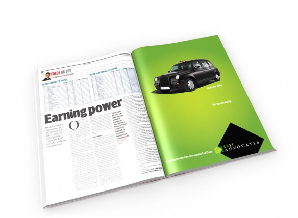
Cost Advocates is a London based firm that handles a wide range of cost drafting, auditing, negotiation and litigation services.
They specialise in protecting clients from legal costs claims, working mainly on behalf of insurer clients who are often faced with huge legal costs bills as a result of both winning and losing insurance claims.
The Challenge:
Having previously being owned by Capita, the existing Cost Advocates logo used Capita’s generic corporate typeface and colour scheme with no appreciation for the specific market that they operated in, or their target customers.
30two was asked to create a vibrant new identity and brand personality to break free from the industry trend of blue, white and grey. The brief was to portray a confident, experienced and innovative firm to appealing to key decision makers across their customer base.
The Solution:
An important part of Cost Advocates business is negotiation. Therefore a distinctive logo marque was devised around the concept of negotiation with overlapping arrows creating a diamond shape. This shape represents the ZOPA or ‘zone of possible agreement’ and was carried throughout various other marketing materials from brochures to press adverts.
As a direct reaction to the blue/white trend, a black and green colour palette was created to give weight and gravitas to the brand. Subtle use of a brighter green was used throughout as a highlight without being overbearing.
Cost Advocates’ heart of London location is also very important within the sector, so treated images of the financial district skyline were also used throughout marketing materials and the website.


