Orean is a leading contract manufacturer of personal care products.
Based in the UK, this expert manufacturer creates bespoke products for hair, skin, body and sun care. Many of their formulations have won prestigious industry awards.
The Challenge:
Although Orean is an established company, their existing logo was a little dated and often wasn’t completely legible when printed on certain materials, so they commissioned 30two to completely redesign their identity.
![]()
The Research:
The research process aims to gain insights and understand the essence of a brand by thoroughly investigating all aspects of a business; from the meaning of its name, its products, services and corporate culture, to its competitors and the general industry that it operates within.
Discovering insights is important in order to develop a brand concept which truly represents and reinforces key aspects of a business. Symbols and images, rich in meaning and relevance, can make the difference between a good brand identity and a great one.


The Concept:
Following a review of Orean as a business and brand, a concept was developed taking inspiration from:
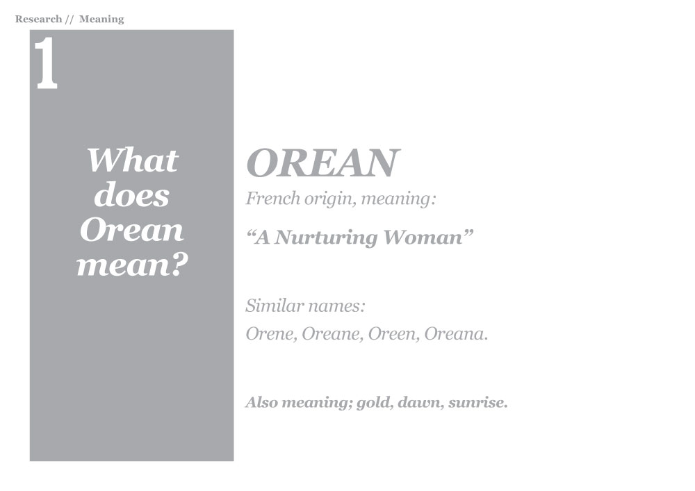
- What does Orean mean? = “Nurturing Woman”
- What does Orean do? = “Manufacturer of bespoke personal care products, including; hair, skin, body and sun care creams and lotions”
- What is the simplest way to represent Orean? = A circle (capital letter ‘O’)
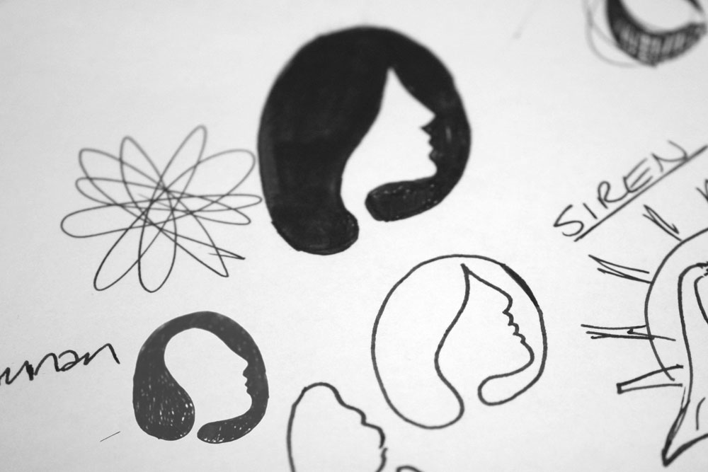
This involved lots of brainstorming sessions (mind-mapping), and pages of initial logo ideas and sketches.

Potential ideas were identified and developed with more sketching, before being redrawn in Illustrator and refined further.
![]()
The final concept combines the caring face of Orean (literally meaning ‘nurturing woman’), with liquid drips to represent the lotions and creams manufactured by Orean, all contained within a circle shape to signify the capital letter ‘O’ for Orean.

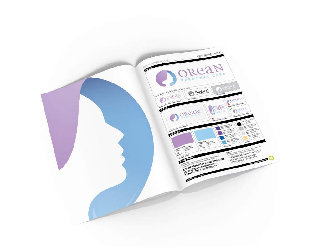
The Solution:
A soft colour palette was created to complete the identity. Subtle gradients were added to give depth to the logo while retaining a caring aesthetic.
![]()
![]()
The Results:
The logo was then applied to various stationery, marketing and advertising materials and supplied with a brand guidelines summary document.